
- Standard signs that are clear and easy to read, that have sufficient colour contrast and use an appropriate typeface and type size can be used by many visually impaired people as well as non-impaired building users
- Audio information should be provided in lifts (see Design Note No 3 – Lifts), in reception areas (see Design Note No 2 – Internal circulation) and in auditoria and meeting rooms (see Design Note No 7 – Entertainment and places of assembly).
- There should be optimum lighting levels in all areas at all times of the day.
- There should be a good contrast in brightness or colour between doors and walls, floors and walls, and furniture and surrounding surfaces.
- Where pre-visit information is provided, it should be available in large print and audio formats.
- Have a high contrast between text and sign background.
- Have a high contrast between the sign and the surface on which it is located (in the case of house style signs where the sign board colour is fixed it will be necessary to provide a contrasting border around the sign).
- Have a matt finish.
- Be well lit to ensure optimum legibility, without glare.
- Be positioned consistently, so people know where to find each type of information.
- Wherever possible, be fixed at eye level – between 1.4m and 1.6m above floor level.
- Be fixed in such a way that neither the sign nor its supports become a hazard to visually impaired people.
- Use a clear unembellished (sans-serif) typeface, e.g. Helvetica or Arial.
- Use sentence case (not all capitals), even in headings.
- Not used underlined text (headings could be a larger size and mildly emboldened).
- Use left aligned (not justified) text.
- Have letter heights that are large enough to be clear, having regard to the distance from the viewer to the sign.
Tactile (embossed) signs are important for people who have sufficient vision to locate a sign but not to distinguish individual characters. Tactile signs should: –
- Be positioned between 1.4m and 1.7m above floor level and at a distance of approximately 0.5m.
- Be embossed and not engraved. The height of embossing should be 1 mm to 1.5mm, the stroke width should be 1.5 mm to 2 mm, the edges should be slightly rounded and the minimum character height should be 15 mm.
- Always be used on toilet and bathroom doors; near lift call buttons; at the top and bottom of flights of stairs; and wherever it is necessary to show the function of a room.
- Where space and cost permit Braille can also be included though the number of Braille readers is estimated to be just over 1% of partially sighted people.
- Tactile maps showing the building layout and main routes can be useful, but as with tactile signs, people have to learn to use them.
Symbols or pictograms should: –
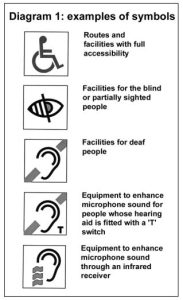
- Be of a standard design if one is available (see Diagram 1). If it is necessary to use a non-standard design it should be simple and uncluttered.
- Any language accompanying the symbols should focus on the accommodation or service, not on who uses it. For example, ‘ramped entrance’ may accompany the wheelchair symbol because it is not just people in wheelchairs who use ramps but also people with pushchairs and prams and people with luggage.
- Use language that fosters dignity. For example, ‘toilet for disabled persons’ not ‘disabled toilet’.
It is particularly important for people who are deaf or hard of hearing that the signing system is clear and easy to follow so they do not need to ask for directions.
Means of improving wayfinding for people who are deaf or hard of hearing:
- By providing good lighting levels to enable people to lip-read, especially at information desks.
- By providing visual announcements, for example to show when the next person should go into a doctor’s surgery.
- By providing visual announcements in lifts to show which floor a lift is on.
- Providing visual fire alarms.
- Installing induction loops at information desks to enable people with hearing aids to hear spoken guidance.